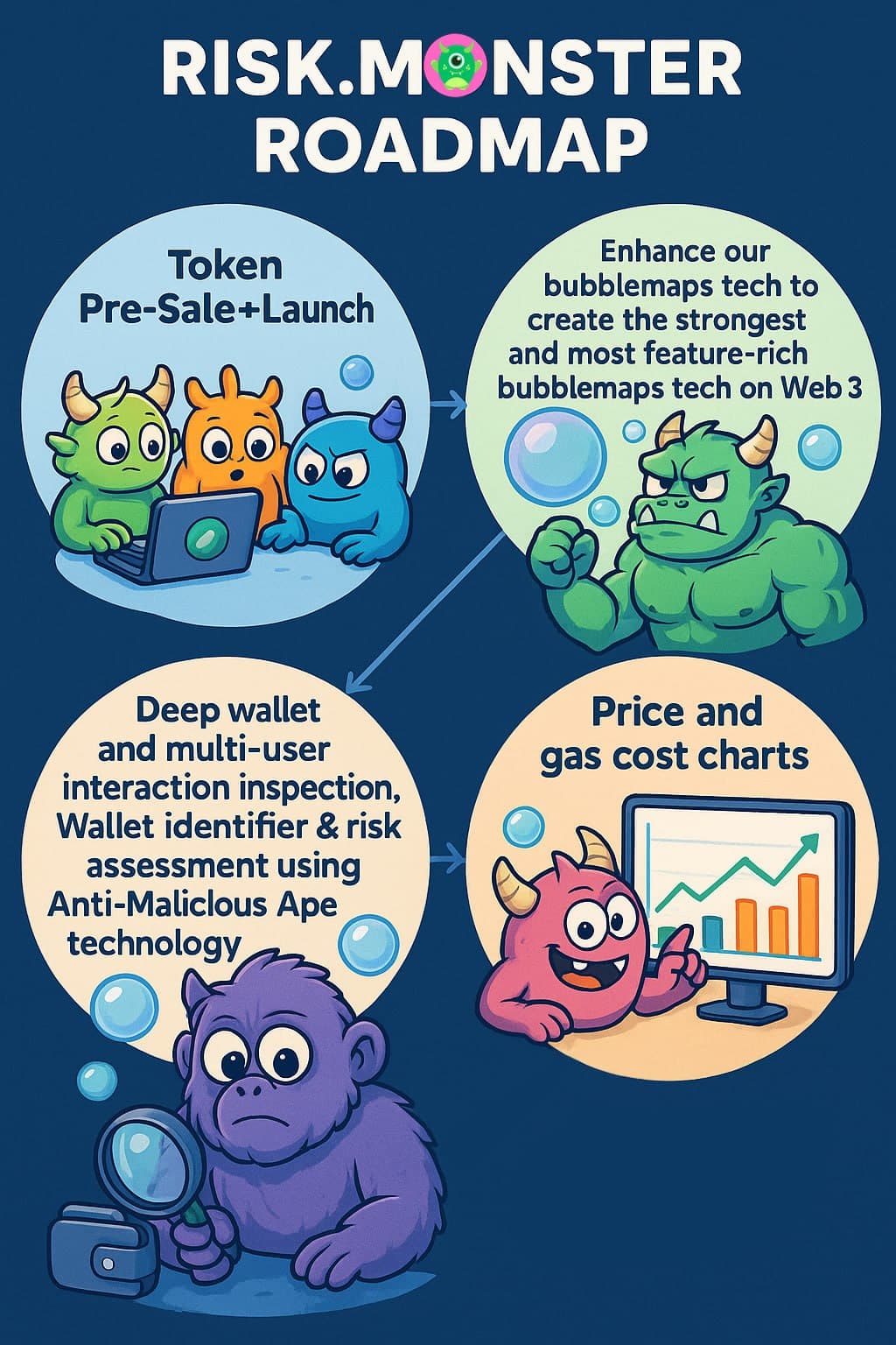
See the Monsters On-Chain
Connect and view our revolutionary new token bubblemap!
No More Snapshots!
See the entire token history all in one bubblemap! No need to go through endless snapshots to find what you are looking for.
More Bubbles!
Our unmatched analytics engine can show as many nodes as your device can render huge bubblemaps with thousands of nodes, coming soon!
Clear and Robust Indicators
Token holders are analyzed in detail and colorfully labelled like never before!
What Is a Bubblemap? A Visual Network Diagram
- •A bubblemap is an interactive diagram that uses circles (bubbles) of different sizes and colors to represent token holders and transfers between them.
- •Its core purpose is to visualize activity, showing how individual entities are connected.
- •The size and color of each bubbleis proportional to a specific quantitative value, such as market share, number of connections, or total volume.
- •It transforms a complicated spreadsheet of data into an intuitive and instantly understandable visual story.
What's Inside a Bubblemap? The Key Building Blocks
- •Nodes (The Bubbles): Each bubble is a single cryptocurrency address, blue for wallets and orange for contracts.
- •Connections (Links): Lines between bubbles explicitly show records of transfers between addresses.
- •Interactivity: Users can typically click, hover, or zoom to get more detailed information about each bubble and its connections.
Why Use a Bubblemap? From Data to Insight
- •Audit & Due Diligence: To quickly identify the major holders or influencers in a system and see if ownership or control is dangerously concentrated.
- •Identify Anomalies: To spot outliers, unusual connections, or unexpectedly large entities that may warrant further investigation.
- •Simplify Onboarding: To provide a "big picture" overview that helps new users assess how well distributed a token is quickly.
It's Not a Static Picture: Engaging with the Data
- •Drill-Down for Details: Clicking on a bubble reveals data about that specific address, clicking on a connection reveals data about transfers between two addresses.
- •Filter and Highlight: Clicking a node highlights all of the connected nodes in a brighter color.
- •Dynamic Exploration: Users can drag bubbles, zoom in on clusters, and explore the network.
Key Takeaways: Clarity from Complexity
- •Intuitive Understanding: It provides an at-a-glance summary of a complex system that would be difficult to grasp from raw numbers alone.
- •Reveals the "Who" and "How Much": Instantly identifies the most significant entities and the scale of their influence.
- •Exposes Hidden Relationships: Makes the invisible web of connections between entities visible and understandable.
- •A Tool for Investigation: It is not just for presentation; it's a dynamic tool for exploration, auditing, and discovery.
- •Democratizes Data: Makes complex network data accessible to a non-technical audience, enabling better collective decision-making.